Final Portfolio
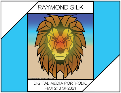
For this assignment, I knew I wanted to use my 2nd canvas for my cover page since I never got to submit it, and I wanted the theme to follow it since it was my favorite piece that I created. As soon as I opened up InDesign, I immediately went for 1/2 inch grids across every page because it gives accurate squares so I can line everything up to make the entire document symmetrical and accurate. I chose the 1/2 inch specifically since it allows me to make squares, rectangles, and spheres all perfectly shaped since I can place them evenly across sections. Once this was done, I began by placing my canvas in the center and building around it. I wanted my cover initially to look like a letter with the corners folded, but I decided to have my text make the front page symmetrical. I wanted my theme to be cyan and white and have a strong focus on consistency and symmetry, and I believe that I achieved that. This project made me realize how much work I have put in throughout this entire course, and how far I have come. Before this course, I had never used any Adobe products, and now I feel confident that I am capable of using them for somewhat advanced purposes. I am happy with my work, and I am glad that this course has real world application and benefits my future, not many courses can say that. A special thanks goes to Professor Encheverry for not only being challenging and informative, but for explaining the real world application that applies to this course. Thank you for everything, this is the first class that I have taken that has been able to resonate with me and allow me to excel for my future.


Comments
Post a Comment