Final Portfolio

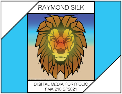
For this assignment, I knew I wanted to use my 2nd canvas for my cover page since I never got to submit it, and I wanted the theme to follow it since it was my favorite piece that I created. As soon as I opened up InDesign, I immediately went for 1/2 inch grids across every page because it gives accurate squares so I can line everything up to make the entire document symmetrical and accurate. I chose the 1/2 inch specifically since it allows me to make squares, rectangles, and spheres all perfectly shaped since I can place them evenly across sections. Once this was done, I began by placing my canvas in the center and building around it. I wanted my cover initially to look like a letter with the corners folded, but I decided to have my text make the front page symmetrical. I wanted my theme to be cyan and white and have a strong focus on consistency and symmetry, and I believe that I achieved that. This project made me realize how much work I have put in throughout this entire cour...


